|
|
Posted By Jacob Hope,
31 July 2020
Updated: 31 July 2020
|
We are very excited to welcome Satoshi Kitamura to the blog to talk about illustration and his books. Satoshi was awarded the most exciting newcomer with the 1993 Mother Goose award for Angry Arthur. He has been shortlisted for the Kate Greenaway Medal with Millie's Marvellous Hats. It's a real pleasure to welcome him to the blog!
Can you tell us a little about your career?
I wrote and illustrated my first story when I was 19 years old. I showed it to some publishers but nothing happened. About the same time I started to work as a commercial illustrator for magazines and advertising.
Since I was a child I always wanted to go abroad and see the world outside my country. So when I turned 23 I quit my job and decided to leave Japan for UK with the money I save in the last couple of years. I really liked London and spent so much time walking about to get to know the different areas. At the same time I was in search of what I wanted to do with my life.
One day while getting bored lying in my bed I came up with an idea for a story. I wrote it down and drew some illustrations. I made photocopies of it and sent them to ten publishers. Most of them told me that they were interested and invited me to their offices. Two of them were quite keen and tried to publish my story but in the end it didn’t work out. Then I met Klaus Flugge of Andersen Press. He wasn’t too impressed by my story but liked my drawing and gave me the text of Angry Arthur written by Hiawyn Oram. It became my first book to be published in 1982 and everything started from there.
I am most grateful to Klaus who has published so many books of mine since and Hiawyn who wrote such brilliant stories for me in my early years.
Where do you work?
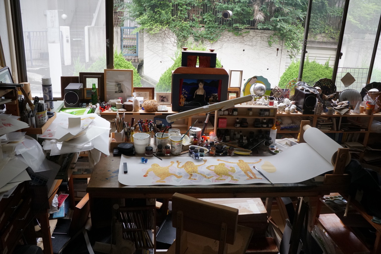
I had a good size studio for my book works but because sometimes I do other things like sculptures in wood, I needed to have a bigger space. I have lots of carpentry tools and timbers and my studio got too cramp. Recently a flat downstairs became available so I rented it for the work I do that isn't on books.
The photo is the table where I work. There’s a scroll of paper spread over it. I buy a big roll of water colour paper and use it as it is. There’s a roll holder that I made on the right end of the table. When I finish a drawing I it out and pull the paper onto the left and start a new one.
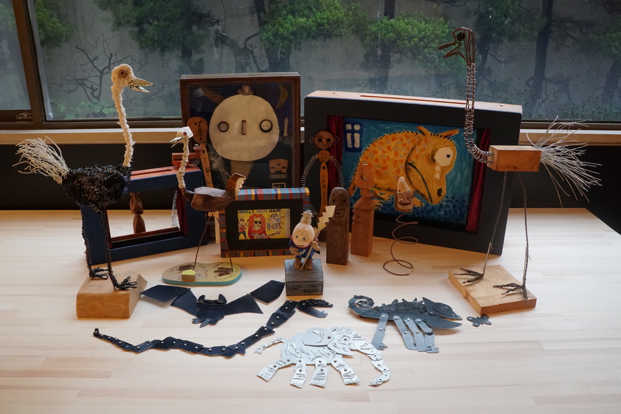
The other photo shows my kamishibai theatres and other objects I made.
Can you talk us through your approach to creating picture books?
It may start with doodles in my sketch book. An interesting phrase or sentence in a conversation I overhear in a café might become a starting point. Something quite ordinary can be an inspiration. If you see something common like a pencil as if you see it in the first time in your life, it suddenly looks so interesting that you would like to write a story about it ( as a matter of fact I have a pencil story that I’m writing at the moment. It’s nearly there but need few more ingredients to make it work).
You have worked on signage for sites like Eureka in Halifax and Seven Stories in Newcastle. Do you think we make enough of illustration?
Many signages we see in streets or towns are very useful but sometimes if they had more characters and humours, not an obviously funny houmour but something subtle and witty like Ampelmannchen, the traffic light figures used in East Germany, our daily life becomes a little nicer.
You've worked with some incredible authors and poets, what are the differences between illustrating other people's work and your own?
I am very lucky that I started my career illustrating Hiawyn Oram’s text. Angry Arthur is one of the greatest picture book texts. I learnt so much from illustrating Hiawyn’s writings.
I illustrated Roger McGough’s Sky in the Pie and it was a very interesting experience because I hardly knew anything about English poetry before then. Again, it was fortunate for me that my first poetry teacher was such a distinguished poet. The book taught me the joy of reading poetry and illustrating them.
John Agard and I come from very different background but we get along so well artistically as well as friends.
I love illustrating his books and at the moment am working on his picture book text.
Comic Adventures of Boots was, as the name suggests, told in comic strip form - as well as being comedic! - what differences are there working in this form, is it something you'd consider returning to?
Putting it simply, a picture book is a little like visual poetry while comics is theatre; you have to tell a story in dialogue like a play or film script.
It’s a very different approach from a picture book. Recently I have done some comics for literary magazines for adult readers. I’m beginning to understand how to write and illustrate comics and I like it even more. I’d love to do another comic book for children some day.
Which illustrators and what style of art do you admire?
The 1960’s graphic design and illustration from Japan, US and Europe were huge influence for me. Also, I have seen all kinds of paintings and sculptures from all over the world. There are so many artists I admire but if I chose one or two. . .
Paul Klee and Enku, Japanese Buddhist sculptor in 17th centry.
The idea of expression and emotions run through many of your books and feature heavily in The Smile Shop, please can you introduce us to the book?
I have been to Mexico and other Latin American countries many times. I tried to learn Spanish at one point. A word for smile is ‘sonrisa’ in Spanish and I made up a word ‘sonrisaria’ the shop that sells smile. I liked the idea and made a rough sketch in very simple Spanish with pencil drawings about 20 pages. I thought of publishing it in Mexico because ‘sonrisaria’ sounded better than ‘smile shop’ to me. But I’m so much familiar with English publishing I showed my translation from Spanish to English to Scallywag Press. Sarah Pakenham, the publisher and Janice Thomson, the editor liked it, so I started to work on it in English.
While I was working on the book Brexit happened and that made me so sad. I left UK in 2009 for good after living there for 30 years, so it’s none of my business perhaps but I felt as if the country that I lived and had loved had become a different place. The Smile Shop is a tribute to London that had been a part of my life for so long. After finishing the book I realized both ‘Millie’s Marvellous Hat’ and ‘The Smile Shop’ are stories about someone getting something nice because they didn’t have money.
You've run workshops around Kamishibai storytelling, can you tell us a bit about this?
I’ve done workshops in Japan, UK, Latin America, Korea, India, South East Asia, Dubai and South Africa.
I enjoy meeting children. One thing I learnt having met so many children in different countries is that they are not different. Their sense of joy and fun are same. They speak different languages and their parents’ politics might be poles apart but people are same when they smile and laugh.
To see Satoshi performing a Kamishibai version of Hat Tricks (highly recommended!), please click here
What are the differences between how children's book illustration is created and considered in Japan and in England?
There may be some differences between the cultures but I always try to find something in common.
Are you able to tell us what is next for you?
Apart from a book with John Agard, I have quite few ideas for the next book but haven’t decided to pick which one to start working on it. I’m busy preparing a show of paintings and sculptures in a gallery in Kobe in October at the moment.
A big thank you to Satoshi Kitamura for his time and insights and to Scallywag Press for the opportunity.

Attached Thumbnails:
Tags:
Diversity
Illustration
Raising Voices
Reading
Reading for Pleasure
Visual Literacy
Permalink
| Comments (0)
|
|
|
Posted By Jacob Hope,
30 July 2020
|
Ronda and David Armitage's The Lighthouse Keeper's Lunch recently celebrated its 40th anniversary. We are delighted to be joined by Ronda and David Armitage who have written a guest blog about the latest title in the massively popular series, The Lighthouse Keeper's Mystery and are lucky enough to be able to provide a behind-the-scenes glimpse at the development of some of the book's artwork.
In 1974 accompanied by two young children Ronda and David came to London for a working holiday expecting to be here for a couple of years.
Six months later they moved to East Sussex and soon the family found itself standing on the top of the famous white chalky crumbling cliffs looking down at the Beachy Head lighthouse near Eastbourne. Previous to this trip David had been looking for work calling on assorted publishers initially clutching some of his book design work. He observed that the queue for those carrying illustrations was shorter so illustrated several well known fairy tales to show what he could do.
An editor at Hamish Hamilton, then one of the great children's publishers, liked them and suggested that if Ronda could write a story and David could do some run up illustrations he could be very interested.
Ronda had always loved reading and as an adult taught young children just as the wave of wonderful and less expensive picture books came onto the market so although she thought it was a ridiculous idea she didn’t completely dismiss it.
As the family stood on the cliffs our son noticed a line running down to the lighthouse. ‘Whats that for Dad?’ he asked. David likes to amuse, so his reply was that the line was for the lighthouse keepers lunch.
Ronda might have ignored that throwaway line if that editor had not suggested writing a story. So Ronda stored it away and in her head began to work out a tale.
‘The Lighthouse Keepers Lunch has been in print since 1977 and Ronda and David have lived in East Sussex ever since.
David and Ronda come from Tasmania and New Zealand respectively. Ronda’s parent bought a farm in the ‘back of beyond’ when Ronda was 12 years old. From the verandah we could see a beautiful bay surrounded by hills and cliffs. Further out was an island and at night Ronda went to sleep watching a lighthouse light way in the distance.The sea became part of our lives. We swam, we fished, we played in boats and raced round the rocks seeing who could leap most skilfully.
Ronda discovered her first octopus and tried to carry it to show the friends but it wriggled so much that she returned it to a pool.
Although a number of people camped or visited the bay in the summer holidays rubbish was not a problem. Now photos from around the world show the horrendous piles of rubbish in rivers, lakes and of course in the sea with many creatures mistaking it for food. Life in the sea is in danger.
In 2002 The Lighthouse Keeper's Christmas was published and after eight books about Mr Grinling, he retired from being a Lighthouse Keeper. David and Ronda thought they had written their last Lighthouse Keeper title.
The books have remained popular, particularly in schools for topic work with Key Stage One. David Wood who has written many plays for children rewrote the first book as a musical which was first performed in Oxford Playhouse in 2000 but there have been many performances based on the eight lighthouse books shown around the world.
So Ronda and David settled to doing different things. There were already other books that they had worked on together but David decided he would like to spend more time painting and the books Ronda wrote were illustrated by others. They were so used to working together that at first Ronda would insist on helping the illustrator just as she and David had done as they worked through a story. But this is not what usually happens.The illustrator and the writer very rarely meet until perhaps the illustrations are completed. Fortunately before too long she realised perhaps that was not a good idea. An illustrator needs to have their own ideas about the illustrations.
As we know climate change is having a massive affect on our world and is already causing many changes to the environment and to peoples lives.
Attention has focused on people such as Greta Thunberg and David Attenborough who have spelt out very clearly what needs to happen to avoid catastrophe.
When Scholastic suggested another story about the Grinling family, it seemed to David and Ronda a possible way to introduce some aspects of the contamination of the sea with characters who are already known to many children and in a way that they could understand. It also encourages children to play a part in keeping the seaside clean. The emphasis was on rubbish rather than just plastic for obvious reasons. We also wanted to show the disasters that can happen when the sea becomes contaminated.

Attached Thumbnails:
Tags:
Illustration
Picture Books
Reading
Reading for Pleasure
Visual Literacy
Permalink
| Comments (0)
|
|
|
Posted By Jacob Hope,
29 July 2020
Updated: 29 July 2020
|
One of the challenges when appraising picturebooks and illustrated texts is exploring the ways that artwork and text interrelate to form the narrative. There are numerous ways this can happen, sometimes they can relate to one another in a way that is very literal and linear, at other points this can be far more playful and imaginative. This can provide a real energy and dynamism for storytelling. This walk through has been written to show one way to approach illustrated books and to better understand some of the mechanics as to how these work. Whilst this might be useful in selecting books for storytimes or for sharing, it is intended more as a guide for how to appraise the form as a whole. What better book to use as a walk through than Rosie’s Walk by Pat Hutchins?
Let’s begin by looking at the cover. On it we see Rosie walking purposefully from the hen-house. Rosie is being followed by a fox whose ears are pricked up and are attentive. The style is influenced by folk-art and draws upon conventions of the rustic and the pastoral with images of fields and fruit-filled trees. The colour palette is limited, its original reproduction used only three inks, but nonetheless creates an earthy and organic atmosphere totally in keeping with the subject of the narrative. The artwork makes strong use of triangles, a technique which helps to draw the eye to particular subjects, here the roof of the hen house and its implied suggestion of domesticity and safety, something Rosie is walking away from as she progresses towards the right-hand edge of the page – progression which is in harmony with the Western tradition of reading from left-to-right.
The title uses alternating orange and green text and features both Rosie the hen and the fox. Already the fox is behind Rosie establishing the pantomime-like dynamic for much of the action that will ensue as the narrative progresses.
The title page itself shows a panorama of the farmyard and surrounding fields with Rosie sitting in the henhouse. It acts as a pictorial or prototype map outlining the areas through which Rosie’s walk will occur.
One of the curious developments which happens as we become more accustomed to reading text is that the conviction and confidence to read images often declines. With that in mind, it’s often helpful to read a picturebook more than once and on the ‘first pass’, to concentrate more on text and the opportunities this provides for artwork to enrich or even contradict this. Rosie’s Walk is comprised of only 32 words and a single sentence relaying factually the nature of the journey Rosie has taken.
The narrative itself, however, is far more complex as a reading that explores both the artwork and the text displays. The opening double-page spread shows Rosie walking away from her hen-house. As readers we are given a point of view that allows us to see the fox crouching beneath the hen-house, its tongue anticipating his desires… Rosie is separated from the fox by the gutter of the page.
Page turns are often crucial in picturebooks, they can signpost humour, anticipation and suspense. Here they are used to great effect here as we see the fox leaping towards Rosie. The triangular construction of the farmhouse, of the fox’s ears and on the prongs of the rake lying on the farmyard floor help to establish the set-up for this mini episode as the text tells us Rosie is walking ‘across the yard’. As we turn the page to the next double-page spread, sure enough logic dictates that the fox collides with the rake which bounces and impacts against the fox’s head. Movement lines show the direction the rake has travelled towards the fox. Movement lines around the fox help to show the reverberation and force of its impact. Rosie meanwhile walks on, tempting the reader to turn the page.
The reader’s point of view on the next double-page spread is similar to that of the frogs who have their front legs raised in warning as they see what Rosie cannot, the fox primed with paws forward, ready to pounce upon Rosie as the text tells us Rosie walks ‘around the pond’. Inevitably the fox’s pounce ends up in the pond where the water splashes and ripples on the pond are substitute motion lines. The peace of the pond has been broken as the frogs are thrown into the air and the bird takes flight in fright from the tree.
What we also notice at this point is that a visual rhythm or pattern is being formed where a set-up is established in one double-page spread and the resolution happens in the next. This is a little like the visual equivalent of a rhyme-scheme in poetry and it repeats itself as the fox makes attempts to capture Rosie and is thwarted while Rosie walks ‘over the haycock’ and ‘past the mill’.
The scheme is broken when Rosie walks ‘through the fence’ we see the fox leaping over the fence. There is an intermediate spread which shows the fox landing in the cart before this collides with the beehives that Rosie is walking under. The final double-page spread shows bees exiting their hives in the foreground and, through use of perspective, chasing fox into the background of the picture.
The final page tells us that Rosie ‘got back in time for dinner’ and we see Rosie re-entering the hen-house, returning to safety and domesticity after the adventurous walk. It is not clear whether Rosie has been oblivious throughout to the advances of the fox, or whether using cunning and guile Rosie has been leading the fox on a merry dance. There is a visual clue on the page with the windmill which suggests it might be the latter. The interpretative space between the text and the artwork of the narrative challenge an active and engaged reading making the form a particularly lively and dynamic one to encounter.
With thanks to Jake Hope, Chair of the CILIP Carnegie and Kate Greenaway Medal working party and author of newly published Facet book, 'Seeing Sense: visual literacy as a tool for libaries, learning and reader development.'

Tags:
Illustration
Kate Greenaway
Reading
Visual Literacy
Permalink
| Comments (0)
|
|
|
Posted By Jacob Hope,
14 July 2020
Updated: 14 July 2020
|
The Youth Libraries Group are pleased to welcome Victoria Jamieson and Omar Mohamed to the blog to talk about their graphic novel When Stars are Scattered.
The United Nations estimated there were 71 million people across the globe who have been forcibly displaced from their homes. How important does it feel to have their stories told and to make sure their voices are heard?
OMAR: I wanted to tell my story because I wanted to be a voice for the voiceless. My story is like any other refugee’s story. No one chooses to be a refugee, to leave their home, country, and family. The last thing I wanted in this world was to be a refugee. I hope readers gain an understanding of how no one would ever want to leave their country unless circumstances force them to leave.
VICTORIA: I am honored that Omar entrusted me with this story. It was a privilege to get to know Omar and his family through listening to his story and bringing it to a graphic novel format. I learned so much about the daily life and the struggles of living in a refugee camp. Since there are so many people displaced from their homes, it's important to listen to these stories.
Omar, You were already drafting your story when you met Victoria Jamieson, can you tell us anything about that early draft and did you have in mind at this stage a book for young people?
OMAR: I have always wanted to write a book to educate others about my experiences as a refugee. I had already started drafting my story when I met Victoria. I had envisioned the book as one for adults. I didn't have much experience with children's books or graphic novels at the time. I may continue with a book for adults at a later date.
How did the pair of you meet and how did the idea for the book come about?
OMAR: We met when Victoria visited Church World Service, the organization I work for that is dedicated to showing welcome to refugees, immigrants, asylum-seekers and other uprooted people within the United States, who are seeking safety and the opportunity to rebuild their lives. I was introduced to her by my coworker who was showing her around the office. After the introduction, my coworker told Victoria how I always wanted to write a book.
VICTORIA: I had been volunteering with my local resettlement agency, and through that experience I met lots of people and heard harrowing and heartbreaking stories of their journey to the U.S. I had already been thinking about the possibility of a graphic novel based on some of the stories I'd heard, but I didn't know where to start. When I met Omar and we decided to collaborate, neither of us had any idea what the end result would look like.
Can you tell us a little about how the collaboration worked?
OMAR: We met in person and used other means of communications, including phone calls and text. I have a busy daily life, so we would meet during my lunch breaks or during the evenings or weekends.
VICTORIA: When it came to creating the art, that was something I did at home in my studio. We didn't meet in person as much during this time, but I was in constant contact with Omar throughout the day. I would send him screenshots of the pages I was currently working on to make sure the details were correct. I mainly looked at internet pictures of Dadaab to create the art, and it was important to me that scenes in schools, market, or homes were as Omar remembered them. We also worked with our amazing colorist, Iman Geddy, based in Atlanta, Georgia. She would send digital files after adding color, so Omar and I evaluated the art at every stage, from early sketches to final files.
Were there challenges in revisiting the past to tell such an intimate and personal story?
OMAR: In my current role with Church World Service, I work with refugees arriving to the U.S., but I also share my story frequently with local organizations and outreach programs. By sharing my story, I hope to inspire others to always persevere.
A lot of the story is deeply affecting, what considerations were there in making this a story for young people? Did this affect any of the content or shaping of the story and if so how?
OMAR: We did leave out some details; these may be included in a future book for adults!
VICTORIA: Omar and I had lots of discussions with our editor, Kate Harrison, on how to depict the more graphic parts of the story. When we had flashbacks to Omar's early childhood and the events that led him to flee Somalia, we depicted the violent acts off-panel. Similarly, we hinted at the violence that women and girls face during times of crisis. Older readers and adults may pick up on the subtleties, but we were careful to keep our audience in mind. We wanted the story to be honest, but not overwhelming for young readers.
Graphic novels have been used to convey often very complex and sophisticated stories - Spiegelman's Maus, Stassen's Deogratias, Joe Sacco's work. What qualities make the graphic novel form so well suited for this?
VICTORIA: Graphic novels, to me, are a very intimate reading experience. When I read a graphic novel, I feel like I'm invited into a character's world. As an American, I didn't know what schools in a refugee camp looked like, or markets, or bathrooms. A graphic novel seemed like a good introduction to what is likely a new way of life to readers living in the US or the UK.
How can readers who have been moved by When Stars are Scattered make a difference?
VICTORIA: I always thought the refugee crisis was happening far away from me, and there was nothing I could do to help. I was wrong! I learned there was plenty I could do to work with recent immigrants and refugees, right in my own community. Readers can search for local refugee resettlement agencies; they will offer many opportunities to volunteer. I also hope readers will check out www.RefugeeStrong.org. This is Omar's non-profit organization that continues to empower students living in Dadaab.
OMAR: Empowering and supporting refugees is key to helping them succeed not only in the camps but also in their new communities. I hope readers will get to know their neighbors, even if they have different clothing than you or speak with a different accent than you. One kind action can have a huge influence in another’s life.
Thank you to Victoria Jamieson and Omar Mohamed for such an inspiring interview.

Attached Thumbnails:
Tags:
Autobiography
Graphic Novels
Illustration
Reading
Reading for Pleasure
Refugees
Visual Literacy
Permalink
| Comments (0)
|
|
|
Posted By Jacob Hope,
03 July 2020
Updated: 03 July 2020
|
There is always something exciting about encountering a new talent, a voice that has something fresh to say and a new style through which to convey this. We are delighted to welcome Soojin Kwak to the blog. Soojin has a degree in illustration from Kingston University in Surrey. Her first picturebook A Hat for Mr Mountain was published by Two Hoots and in 2019 Soojin won the Bologna Book Fair Silent Book Prize for her silent picture book Starbuilders. Soojin lives in South Korea but enjoys spending time in the United Kingdom.
When did you realise you wanted to be an illustrator and can you tell us a little about your training?
Who doesn't have childhood favourite characters, picture books, or animations? I especially liked storybooks. When someone crumpled or scribbled my book, I cried until my parents bought me a new one. However, I couldn't buy all the books I wanted. So I drew the characters and pictures I liked and wanted to keep, and I think I might have wanted to be a person who draws something I love from then on. Especially for pictures with stories. So From then to now I just didn't stop. I went to art high school, university, and finally came to London, the place of illustration lovers.
What kind of books did you enjoy as a child and why?
I liked the story of animal characters that don't give up. For example, I still remember the penguins who hated the cold. The penguin did not give up despite numerous attempts and frustrations to get to a warm place. I really liked it. Even the boldness and courage to spur an environment that is stable and familiar but doesn't suit him.
There are some wonderful comments on creativity, kindness and belonging as part of a community in A Hat for Mr Mountain, what do you hope readers will come away feeling?
When you create something, difficult things happen. Sometimes the problems seem impossible to solve, alone. This requires kindness to be willing to help and cooperation by sharing the issue. I don't want readers to be afraid of creating something and I hope that they are willing to help each other when difficulties arise.
Can you describe your creative process in writing and illustrating the book?
It all starts with imaginations. I enjoy creating something unfamiliar by combining familiar things. For example, hats and animals, stars and builders. If I find these materials I start imagining, polishing them with doodles. After that, I make it up to something that can be used for the storybook and arrange it at the end.
You came second in the Macmillan Prize for Illustration. How important are prizes like this in giving a platform to new illustrators and what effect did this have on you?
I was a third-grade at this time who wasn't sure what to do after graduation. If I hadn't won this prize, could I have the courage to publish a children’s book? Especially as a foreigner, I don’t think I would have had the courage enough to visit the publishers with my dummy books and explain these fluently. The award-winning experience made me aware that there was a prize for the effort, and gave me the opportunity to meet experts in the publishing field. It also gave me the opportunity to enter the next competition. Of course, the best reward was my precious first storybook.
You won the Bologna Book Prize for Silent picture books, are there any techniques that are needed to tell a wordless stories and ways to help ensure the pictures carry the story?
In my memory, children’s books seem to have always been accompanied by words and pictures. But how was it before I could read? We must have created our own story by seeing pictures. So I think silent picture books are a collaboration between the author and the reader. That's why I think it's most important to catch empathy for the topic I'm trying to convey.
I was worried whether the audience might understand the content of my book or think it was unrealistic. But one of my child audience’s words made me a fool. “I knew it!”, She said she already knew about this secret process of making stars. It made me more entertaining than any response, because I really didn't have to explain anything, it was totally silent.
Have you noticed any differences in terms of prevalent styles or attitudes towards illustration in the UK and South Korea?
I am not an expert to analyze. So just to explain what I have felt, UK illustrations have a distinctive colour style and mix well with faces and lines. The composition and form are more abstract and more artistry than descriptive. In Korea, lines are more distinctive and more descriptive.
What's next for you?
In fact, this question is the simplest but most difficult to answer. Of course, I'm planning to publish my third book, hoping it's more unique and fun than the previous two. And after that, I wish to have a fourth and fifth book if possible. Also, I am trying to build an entertaining character like the Moomins or the Gruffalo, which is my dream for now. I rather to be known as a delightful character or story than my name. I want to remain in the memories of childhood, like I still remember the old favourite fairy tales.
Thank you to Soojin for making time to be interviewed and for generously allowing us to share some of her illustrations which are well worth exploring below. To see more of Soojin's work, why not visit her website at https://www.kwaksoojin.com/

Attached Thumbnails:
Tags:
illustration
Reading
Reading for pleasure
silent stories
visual literacy
Permalink
| Comments (0)
|
|
|
Posted By Jacob Hope,
25 June 2020
Updated: 25 June 2020
|
We are delighted to be joined by Walker Books Art Director, Nghiem Ta, for an interview. Nghiem worked with Shaun Tan, on Tales from the Inner City the 2020 winner of the CILIP Kate Greenaway Medal. Thank you to Nghiem for sharing her expertise and experience so generously.
Please can you tell us a little about your job and what it entails?
When I’m asked, outside of publishing surroundings, what I do, I say I make children’s books. No, I don’t draw the pictures. No, I don’t write the words. I’m responsible for how it looks and feels. Like a conductor of an orchestra or the director of a film, I work with a team of people that all help to create an end product. But to an Illustrator, I try to be their trusted advisor, assistant and supporter.
Since the emergence of e-books, it feels there has been something of a Renaissance of printed books with increased production values and aesthetics, how important are considerations of the physical attributes of a book to its publication?
For me, the physicality of a book has great significance. I believe the sense of touch can be another conduit for learning. I’ve seen children read and discover books via their fingers; they can explore pages using touch and then they read and look at each new discovery. A tactile experience is a way to engage and create memories.
(I started my career as a designer and paper engineer – I have a completely biased view when it comes to a love of physical books!)
What are the design decisions made when publishing a book and what kind of impact do you feel these have on the overall reading experience?
I think the most important element in the creation of a book is clear communication. Whether this comes from struggling to read English as a child, I’m not sure. I do know that pictures were my way into understanding.
Across the many elements that make up a book, we have to make sure we convey the story, emotions and information to the reader as intended by the author. That clarity needs to come from everything, from the style and content of illustration to the framework/composition for the pages and the typesetting. You want to be able to pass on that enthusiasm, those emotions and all the revelations.
You worked on the 'Ology' books, can you tell us a little about these and your involvement with them please?
In total, I designed the first twelve of this series of books. I was given the original brief of trying to create a book that was like an illustrated old treasured tome. They were a series of books that truly were the perfect example of teamwork. A team of up to 6 Illustrators, all working in unison. Writer and editor working alongside and accommodating art and novelty elements. Design also working with production teams in-house and at the printers. Working with sales teams all over the world to coordinate and promote each story.
The Ologies were a huge learning experience for me. They have given me such a valuable foundation that now supports my professional knowledge and my relationships/friendships with illustrators and colleagues.
To your mind, what constitutes strong design that complements text and illustration?
A few things come to mind… A great use of space, making the most of the area you have. Every corner, nook and cranny, millimetre square, has been considered. Then, there’s the awareness and use of negative space. Don’t ignore the spaces in-between. Sometimes, they are a luxury! Last point for now, a flow across the page that supports and guides the eye/the reader. Allow the reader to explore but don’t lose them!
You worked closely with Shaun tan on Tales from the Inner City, can you tell us a little about that? What kind of dialogue do you have with illustrators and authors?
By the time Shaun Tan was ready to show Tales from the Inner City to Walker Books, he had been working on it for many years. Some of the paintings were large 1.5 metres wide – each painting had to be photographed, then digitally prepared for print. The stories had been worked on by Shaun and his editor friend, Helen Chamberlin.
By the time we saw the completed work, all that was left to do was very much like icing the cake! A light edit and then working with Shaun on various design features. The cover title design started with an idea I had that was inspired by road markings. I created the ‘stencil’, Shaun then ran with it – a design relay.
Given the success of The Singing Bones limited edition box set, we were again able to create a ‘box’ for Tales from the Inner City. The physicality of this box is very much entrusted to me. I think Shaun stands back and wonders what craziness will appear in his email inbox!
The important thing to mention is communication. Shaun is always aware of how I’m treating his work. He should not have any surprises. I explain any design decisions I make if I know it’s something he won’t necessarily do himself. I don’t photoshop anything without informing him.
(You may have to ask him, if he finds this helpful or annoying!)
I hope my take on communication carries through to all the illustrators and authors I work with. Creating books can be such a personal process, especially for the illustrators and authors but as designers and editors we share that feeling of personal contribution to a book.
When working with new illustrators and authors, an initial chat to ‘get to know you’ is always a good start. A good opportunity to discover expectations and working personalities . With illustrators, I always try to discover their method of working, then I can find out where I can support them and if they need to tweak their method to achieve the best printed results.
What are some of the books that you feel most proud to have worked on and why?
I take great pride in all the books I’ve worked on. I grew up having very limited access to books, so I now find myself in a very privileged position. To see your contribution on a bookshelf or in the hands of a child... So chuffed!
Sorry to sound like a broken record, but there’s a lot of pride and gratitude in the relationships and friendships I have made through the years… Even more chuffed!
[Photographic credits: all photographs are reproduced with kind permission of Nghiem Ta. 'Ologies' books are by various authors and illustrators and are published by Templar Publishing. 'Tales from the Inner City' is written and illustrated by Shaun Tan and published by Walker Books]

Attached Thumbnails:
Tags:
Design
Kate Greenaway
Shaun Tan
Visual Literacy
Walker Books
Permalink
| Comments (0)
|
|
|
Posted By Jacob Hope,
14 June 2020
|
Chair of the Carnegie and Kate Greenaway working party and Youth Libraries Group blog editor Jake Hope shares his first experiences attending National Conference...
My first job in libraries involved working on the Lancashire Book of the Year award. It was an amazing experience and a chance to really excite and engage young people in books and reading, showcasing that both can be vibrant, creative and social! It did feel isolating, however, as much as I'd hoped to share experiences and enthusiasm with colleagues, with the exception of my line-manager, there were rarely opportunities for that.
Joining YLG was the most incredible tonic, at last, I felt like I'd found 'my people'and 'my spiritual home'! The group was so friendly and welcoming and my first conference was brilliant - I well remember having breakfast with Wendy Cooling and talking with her about BookStart, being invited to join the Random House crew on their table for evening meals and hearing about their forthcoming titles,hearing then Children's Laureate - Jacqueline Wilson - talking about the plans she had for her tenure and talking with Janetta Otter-Barry (then of Frances Lincoln) and Nicky Potter around representation in children's books.
I came away buzzing with ideas and with bags chock-full of books, posters, resources and more and having made new friends - and indeed future colleagues! These are not easy times for librarians working with children and young people and this year has been particularly challenging. Connections and community become ever more important against this context and that is one of the deeply special things about conference, it's a chance to network and to connect not only with other professionals, but also with ideas and creative ways of working.
Our conference this year is called In the Frame: Putting Readers in the Picture and it is scheduled to take place at the impressive Imperial Hotel in Torquay from November 20 to 22. There will be an astonishing range of authors, illustrators and experts attending. Over the coming weeks we will be teasing more content. For further information about the conference, including its programme, visit here
We hope we can welcome you to what promises to be an incredibly special and memorable weekend.
Special thanks to sponsors Nosy Crow and the National Trust and to illustrator Britta Teckentrup for the conference cover.

Tags:
Conference
Illustration
Reading
Reading for Pleasure
Visual Literacy
Permalink
| Comments (0)
|
|
|
Posted By Jacob Hope,
08 June 2020
|
To celebrate the 2020 shortlists of the CILIP Carnegie and Kate Greenaway Medals, we will be holding a Twitter Takeover on 14 June. This will be an opportunity to engage and interact with judges and key personnel of the awards and to hear more from the shortlisted authors and illustrators. The Youth Libraries Group are delighted to announce the provisional programme for the day which runs from 11am to 6pm.
11.00am to 12.00pm Reading around the World
An exploration of the importance of prizes in reading with Shaun Tan (TBC), Kate Greenaway shortlisted author and illustrator of Tales from the Inner City and a representative from the Children's Book Council of Australia, comparing their awards with ours.
12.00pm to 1.00pm Art, Expression and Adversity
Marcus Sedgwick and Julian Sedgwick will talk about their Carnegie shortlisted book Voyages of Orpheus Black in the Underworld and about collaboration.
1.00pm to 2.00pm Empathy and Illustration
Illustrator Poonam Mistry and author and illustrator Chris Naylor-Ballesteros talk about empathy in their Kate Greenaway shortlisted books, You're Snug with Me and The Suitcase.
2.00pm to 3.00pm True North
Chris Mould (TBC) Kate Greenaway shortlisted illustrator of The Iron Man and Anthony McGowan author of Carnegie shortlisted Lark talk about their books set in the North.
3.00pm to 4.00pm Sea and Survival
Chris Vick Carnegie shortlisted author of Girl. Boy. Sea. and Beth Waters, author and illustrator of Kate Greenaway shortlisted Child of St Kilda talk about their books and the role of the sea.
4.00pm to 5.00pm A Sense of Self
Authors Randy Ribay and Dean Atta talk about the role of identity in their Carnegie shortlisted books, Patron Saints of Nothing and The Black Flamingo. Closes with announcement of YLG Awards Shortlist 2020!
5.00pm to 6.00pm Quiz
With CILIP Library Champion Bobby Seagull, via his YouTube Channel.
Please note participants in sessions may change. Please keep your eyes peeled on Twitter from @YouthLibraries.
Make your voice and views part of the discussion #CKG20.

Tags:
Carnegie
Kate Greenaway
Outstanding Illustration
Outstanding Writing
Reading
Reading for Pleasure
Visual Literacy
Permalink
| Comments (0)
|
|
|
Posted By Jacob Hope,
30 October 2019
|
It is a pleasure to welcome Natalie Ramm to provide an insight into her picture book, Man in the Mountain, and the way her career and life have fed into the creation of this.
Six years ago, I took a three month sabbatical from my job in publishing to set off on a road trip across Europe with my husband. The plan was to check out of work entirely – but no sooner had we hit the end of week one, than I felt a sudden urge to write.
Perhaps it was the peacefulness of the surrounding landscape, or just the sheer desire to still be working, but each day I would sit down excitedly to write for a few hours. When our trip came to an end, I filed the stories away and thought little of them for years. This is largely because I work in publishing.
After spending seven years at Penguin Press, I now work freelance – as a copywriter and marketing consultant – for some of the best publishers in town. I love my day job, but there is nothing like it for reminding you of all the reasons never to get your hopes up of being published: there are just too many books – excellent books – being published already, most of which barely anyone has heard of.
Each year, the market seems more crowded, and the space for capturing readers’ attention increasingly small, and contested by all kinds of media. At the same time, in the children’s world at least, big brand authors continue to dominate much of the landscape.
And yet, last year, I started to think about my stories again. And in a fleetingly hopeful moment, I sent a few of them to some smaller publishers who accept submissions directly from authors. I was pretty sure it would come to nothing, so when Ragged Bears said they were interested in publishing Man in the Mountain, I knew not to get my hopes up. I didn’t think about whether the book might be a success or not, because I’d worked in publishing long enough to know that it couldn’t be.
When you work with books (and especially in marketing), you can get fixated on sales figures, and other standard measures of success. But what if ‘success’ just meant you’d written something that people (who aren’t just your mum) actually want to read? What if success was a finished book you were proud of, kind words from respected colleagues, a spring in your step?
Over the past year, as I’ve worked alongside the amazing illustrator Gaia D’Alconzo, my friends and family have often asked ‘aren’t you excited to be having a book published?’. My response was almost always ‘well, it’ll probably sell about three copies’. They would look perplexed, and rightly so – because this is not the attitude to have if you’re writing a book, or creating anything for that matter. Feeling excited and hopeful is an important part of the creative process.
So now, upon publication, I’m allowing back those feelings of hope and excitement I felt when I first sat down to write.
And it’s a thrill.

Tags:
Picture Books
Publishing
Reading
Visual Literacy
Permalink
| Comments (0)
|
|
|
Posted By Alison D. Brumwell,
06 October 2019
|
In her recent guest blog Cicada Books’ publisher and editor, Ziggy Hanaor, explores the importance of illustration and ways in which images “create a story that can set children’s imagination alight.” It’s an inspiring piece for librarians, particularly those of us who are passionate about visual literacy and illustrated text and who actively promote the innovation of small, independent publishers. Ziggy is also a talented writer; “Fly Flies”, her recent collaboration with illustrator, Alice Bowsher, is an example of “the playfulness that happens in the gaps between text and image.” Fly loops and twirls across the sky in her own “buzzy, flappy” (and happy) way, until the birds spot her technique and offer unsought advice about how to fly right. The crisp, witty text is perfectly supported by a bold use of space and limited colour, creating a picture book which celebrates freedom and identity. Many thanks again to Ziggy for her insightful blog.

Tags:
Illustration
Reading for Pleasure
visual literacy
Permalink
| Comments (0)
|
|