|
|
Posted By Jacob Hope,
12 August 2021
|
We are delighted to welcome author and illustrator Debi
Gliori to the blog to introduce her new picturebook A Cat Called Waverley. Debi studied illustration at Edinburgh
College of Art and has been awarded an honorary Doctor of Letters by
Strathclyde University. Debi has won the
Red House Children’s Book Award and has twice been shortlisted for the Kate
Greenaway Medal. Debi will be talking more about the highly affecting and important picturebook A Cat Called Waverley at the Youth Libraries Group annual conference
this year – Representations
of Place: New Lands and New Ways of Looking.
Some years ago, I visited a library in Glasgow to lead
a storytelling session with an invited primary school class. Before the
children arrived, the librarian showed me to the staffroom to drop my bags, and
apologised in advance for the smell which, she said, was particularly
noticeable in the ladies’ bathroom. She explained that in the colder parts of
the year, the library was much prized by the local homeless population. She
tilted her head to indicate where a few people sat slumped in forgotten corners
of the library, dozing behind newspapers in the quiet warmth of the reading
room. The librarian added in a whisper, they sleep here all day, waiting for
their laundry to dry. Seeing my puzzled expression, the librarian continued;
they wash their underclothes in the bathroom sinks, then drape them across the
large Victorian radiators to dry. Imagine.
Indeed. Imagine that your life underwent an unforeseen
and catastrophic shift. Imagine having to rely on the kindness of strangers for
your survival. Imagine being blamed or shamed for allowing such a fate to
befall you. Imagine having no agency, no voice, no vote and no sanctuary for
when the winter comes. Back then, all those years ago in Glasgow, I chose not
to imagine how appalling such a life would be. I had children to raise, books
to write and, heavens, a class of seven-year-olds trooping into the library,
wrinkling up their noses and loudly complaining about the smell.
Many years later, in an older and hopefully more
empathetic version of myself, I met the human subject of my book A Cat
Called Waverley; a homeless war veteran called Darren Greenfield. In my
desire to devise a way to help him off the streets of Edinburgh without turning
him into the subject of some well-intentioned children’s writer’s charity, I
wove Darren’s life into a fictional tale of a war veteran and his faithful cat,
Waverley. I hoped not only to highlight how easy it is to fall into
homelessness, but also to begin a conversation with children, to shed light on
this grotesque state of affairs that wilfully allows our fellow-humans to live
without shelter on the streets of our cities. I also wanted to say to Darren -
you matter. Your life story matters. It is wrong and unjust that you live on
the streets while we live in houses, and hopefully this book will help ensure
that such inequality becomes a thing of the past.
For many of us, the main point of contact we have with
our homeless fellow-citizens is when we see them asking passing strangers for
money on the streets of towns and cities around the UK. Or, when leafing
through the broadsheet press, we encounter an advert exhorting us to give
generously to one of the charities set up to support homeless people. Sadly,
when most of us hear the word ‘homeless’ it doesn’t prompt a surge of empathy
or engender more than the faintest wisp of fellow-feeling. Most of us have no
direct experience of what it means to have nowhere to call ‘home’.
Whether this lack of empathy is a failure of
imagination or a deliberate turning away is immaterial; it results in the same
thing. We place a few coins in the outstretched hand and walk on by. We take a
deep breath and turn the page. We blank out this unpleasant part of the reality
of 21stC life. Moreover, we continue to vote for political parties that not
only allow our fellow humans to live on the streets, but whose policies appear
to actively encourage a moral climate where homelessness is commonplace. We are
encouraged to demonise the unfortunate, to categorise people into strivers and
shirkers and thus avoid any responsibility for our common weal. It’s an all-too
common story, our collective blindness to inequalities and our morally
deficient reluctance to step in to rewrite this potentially disastrous story
arc.
Darren Greenfield’s story ended on the streets of
Edinburgh. After several years he slipped through the inadequate net of social
provisions we extend to our homeless fellow-humans. The news cycle paid brief
attention. One more homeless person died on the streets of a first world city.
Next?
With the ability to turn the world around me into a
story, I’d managed to make over seventy books without once touching on the
subject of homelessness. Until Darren. Mainly, I suspect, because I correctly
guessed that such a book might not only be difficult to conceive and
illustrate, but also that it could be tricky to find a publisher for such a
project. I am delighted that not only did A Cat Called Waverley find an
empathetic and principled publisher, but it also found the best home imaginable
with Otter-Barry Books. Some stories do have a happy ending.
A big thank you to Debi Gliori for the blog
and to Otter-Barry Books for the opportunity.

Attached Thumbnails:
Tags:
Empathy
Homelessness
Kate Greenaway
Picture books
Visual Literacy
Permalink
| Comments (0)
|
|
|
Posted By Jacob Hope,
26 May 2021
|
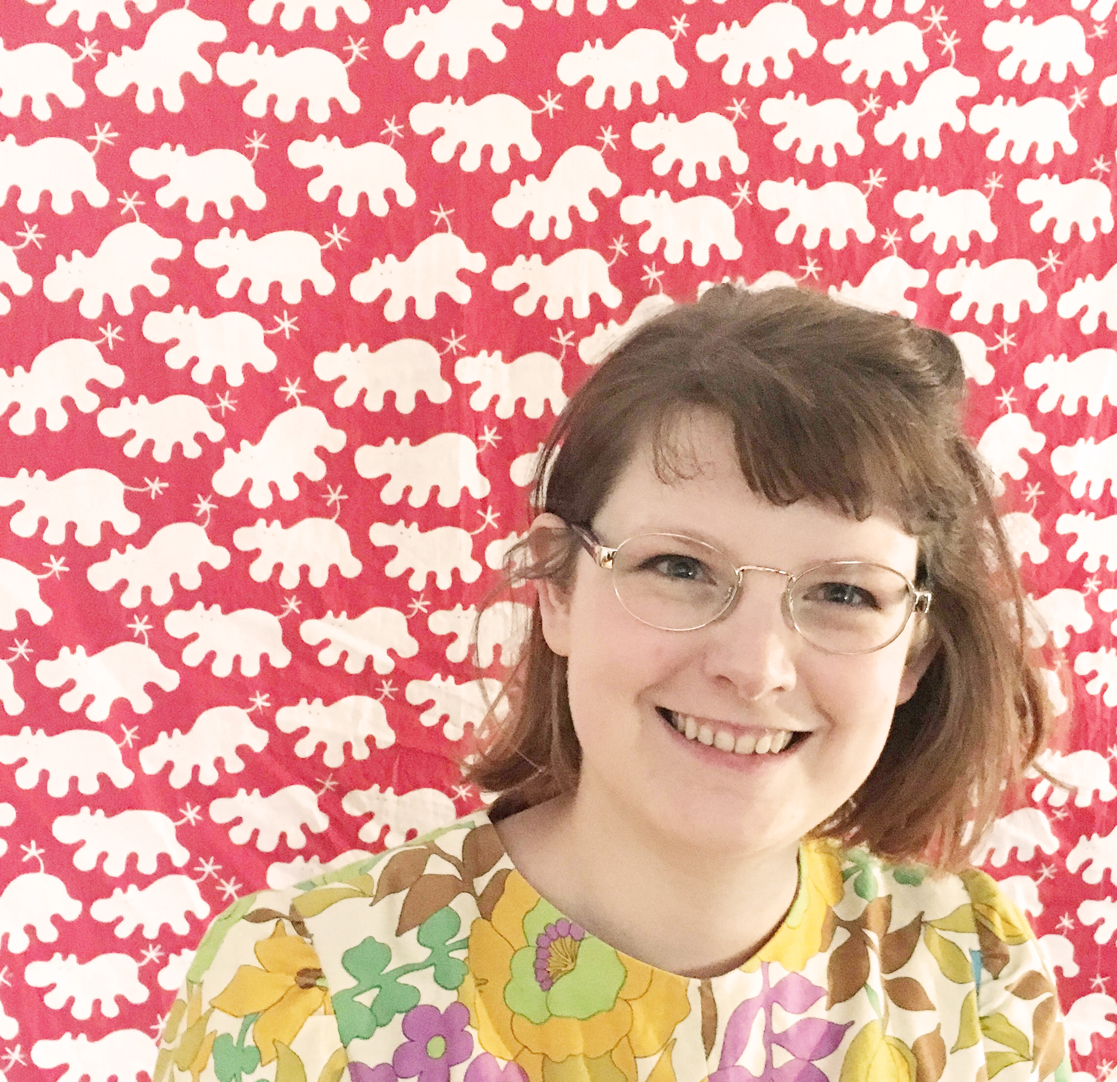
Eva
Eland grew up in Delft, Netherlands. She studied at the School of Visual Arts
in New York as well as at the Cambridge School of Art, where she received a
distinction in children’s book illustration. Eva won the 2020 Klaus Flugge
Prize with When Sadness Comes to Call, which also won a V&A
award, book cover category. Where
Happiness Begins was published in 2020.
With
such a broad range of illustrations and all the different approaches to
storytelling in the longlist of this year’s Klaus Flugge Prize - the prize for
the most exciting newcomer in picture books - it has been very inspiring for me
to delve into and analyse the books. The shortlist contains five very
distinctive books, that feel fresh, original and demonstrate a high standard of
work. Parents, children and book lovers in general are lucky with all the new picture
books they can choose from these days.
The
fact that the books and illustrations are very different from each other in how
they look and what they accomplish, reminds me of just how many functions a
book can have. Picture books can be these beautiful and rich objects we can
share with each other, talk about, enjoy and be comforted by. They can invite
us to reflect on our life, our relationships and put our feelings into words
and images, giving us the vocabulary we might need to deal with some of the
more complicated issues in life. They can offer an escape and stir our
imagination, make us wonder and test our own understanding of the world and our
preconceived ideas. Some might even encourage us to be brave, as they remind us
of the things that truly matter and that we can always return home.
Illustration,
and especially the space between text and image and how they relate to each
other, has such a vital importance to bring all these elements out in a book.
It can build worlds for the words to live in. For children, a picture book can
be their first encounter with art and art, in turn, I think, can help stimulate
an appreciation for the beauty that can be found all around us. An appreciation
that will enrich our lives and help to cultivate a sense of childlike wonder.
To
have a prize that is focused on illustration alone, and that encourages new
talent by celebrating their work and giving them more visibility, is hugely
important in a time where so many new books get published every year, and new makers
might otherwise get lost.
The
longlist for the Klaus Flugge Prize is well worth perusing, as each of the
books has their own story to tell and there are some exceptional and original
new voices in illustration that I’m sure we will see more of in the future.
From
these books, five of them stood out in particular, and make up this year's
shortlist.
My
Red Hat by
Rachel Stubbs is a tender tale, full of love, showing the relationship
between a grandfather and child. They share stories, adventures and dreams
together and we get a sense of all the things that a grandparent might want to
pass down to their grandchild, and the encouragement they can offer to go and
discover the world on their own. This story unfolds in a very organic way and at
a gentle pace, from spread to spread, with the red hat as a visual and thematic
thread holding the words and images together. The unusual landscape format and
the hand drawn typography fit the story and the illustrations perfectly.
Rachel
Stubbs cleverly depicts childhood, with all its ups and downs, and the moments when
you might get lost but are found again and return home, ‘to where you belong’.
The looseness of the marks and the delicate lines add to the gentle and
imaginative atmosphere and the limited colour palette gives it that extra
nostalgic flavour, cherishing the innocence of childhood and the special bond
that can exist between child and grandparent.
A
book that stands out for its very original approach to the illustrations is While
You’re Sleeping, illustrated by John Broadley and written by Mick
Jackson. The book takes us through a night and its creatures, workers and
wanderers. With its absence of a story arch or protagonist, there is a
consistency and rhythm to the words and images that could work like the perfect
bedtime lullaby.
The
bold lines, limited colour palette and collage of patterns are reminiscent of the great English
print-makers of the thirties and forties like Eric Ravilious and Edward Bawden,
yet it feels utterly unique and there is an otherworldly quality to the
artwork, with its wonky perspectives and stiff characters, adding a layer of
mystery to this whole different world that seems to emerge at night.
The
way the light is depicted in this book caught my eye - for the dark nighttime
spreads we see beams of yellow light, with the indoor spaces like the hospital
using the white of the page to indicate brightly lit spaces. Time passes slowly
in this busy night, with clever transitions from the left hand to the right
hand page, some compositions framed by walls and lamp posts, and other spreads
bleeding off the borders creating a sense of vastness and timelessness. Though
this book doesn’t tell a conventional story, it leaves you with a lot of
threads of little narratives and a diverse range of characters you could make
your own stories for. The illustrations are so rich with detail, that you will
have plenty of room to meander through this book, and its night, and wonder
about all the different lives that people are living simultaneously, and maybe
in doing so, one might slowly drift away to sleep.
I was
immediately drawn to the painterly and colourful illustrations by Charlotte
Ager for Child of Galaxies, written by Blake Nuto. I was already
familiar with her work, and it was interesting to see how she managed to bring
her world and visual vocabulary to this text, and give a lot of abstract and
big ideas a sense of place to simmer, allowing them to expand their meaning
further. The fluid quality of the textures, marks and sketchy pencil lines,
combined with a changing colour palette that help shift moods and meaning, fit
the poetic text perfectly. Sometimes the words are paired with bold
compositions, using what looks like collage with painted paper, or using the
very spacious white of the paper itself, creating a lot of room for
interpretation. Other times the text is accompanied by a more sensitive and
emotive image, with shades of a limited colour palette and directional painted
marks, or, for example, looming tree figures that frame a child. Scale,
colours, textures and mark making are used to great effect by Charlotte Ager.
The meditation on nature and the beauty all around in the illustrations, even
when ‘shadows persist’, will offer the reader a lot of opportunities to reflect
on the abstract ideas the text offers.The diverse range of characters makes
this book feel inclusive and directed to all of us, just like the text reminds
us we’re all made ‘from the stuff of the stars’.
Gustavo,
the Shy Ghost is
a classic story in its essence, about a shy little ghost wanting to make
friends, who overcomes his own fear and reaches out. A story that will be
relatable and comforting for those who experience similar shyness and
insecurities (though I bet at times we all have a little bit of Gustavo in us
and will recognise the universal fear of not being seen and invited to play).
It’s hard not to like this character or not identify with the moments of
longing and hesitation (oh, just imagine the anguish of missing a good
opportunity like getting ‘eye-scream’ because you were too shy! Or wanting
to get close to the girl you love but not knowing how to make yourself
noticed).
This
book is filled with details, textures, references and full of the strangest,
yet adorable, creatures, that reappear throughout the book, with a lot to
discover on each spread, making this book a joy to read and I imagine one to
read again and again, reminding little ones that they are not alone.
The
structure of the story and the pairing of text and image are very well crafted,
there is not a word too much, and though the images are full of details to be
enjoyed, it never feels cluttered or distracting, which is a remarkable feat.
There is a strong sense of place, grounded in warm and muted colours, with
Mexican influences and many references to The Day of the Dead, classic horror
films and monsters. The palette of muted colours contrasted with warm orange
and Mexican pink, and clever use of negative space as well, are integral to the
storytelling and add to the sense of drama, and calm, where needed. Everything
in this book, from cover to the final end papers, appears to be very
considered, yet there is a light and playful touch that feels very generous and
authentic, and Flavia Z Drago, not unlike Gustavo playing the violin, seems to
reach out to us, the reader, by sharing her passion for illustration,
storytelling and monsters, uncovering some of our deepest fears and longings
with this very universal story.
I’m
Sticking with You,
illustrated by Steve Small and written by Smriti Halls is a character
driven story, exploring friendship and the push and pull we can sometimes
experience within relationships, especially with those people that are so very
different to ourselves.
Bear
and squirrel are very loveable characters, and Steve Small has allowed himself
to zoom in on them, using only minimal background elements and props to nudge
the story along, on otherwise crisp, white pages. The disparity between text
and image is where the story is told and where the deadpan humour lays. The timing, scale and
body language of the characters are always spot on, adding to the comedy and
betraying Steve Small’s background in animation. There is a lovely twist in the
book, emphasised by using a black background, and a change of direction to
where the characters are going. Here we finally get to see and read the
perspective of squirrel, who, after announcing he needs more space, actually
misses his overBEARing friend a lot. An almost empty page shows his sudden
understanding, and creates a very effective pause before he rushes back and we
near the end of this story.
Looking
at all these shortlisted books and seeing the different ways in which they
excel and exemplify what illustration can do, reassures me that there are so many
ways to tell a story, and so many stories to tell still. But also just how
important it is to cultivate your own, unique (visual) storytelling voice as a
picture book maker. The essence of the stories might not be new in any way -
but the ways they are told feel original and personal, and give the reader the
possibility to connect with the story, ideas and characters. I can’t wait to
see what Steve Small, Flavia Z Drago, Charlotte Ager, John Broadly and Rachel
Stubbs have in store for us in the future.
Find
out more about the Klaus Flugge Prize on the website.
Do check out the picture gallery below showing:
Cover illustration and spreads for My Red Hat
Cover illustration and spreads for While You Are Sleeping
Cover illustration and spreads for Gustavo the Ghost
Cover illustration and spreads for I'm Sticking with You
Photograph of Eva Eland, copyright Signefotar
A big thank you to Eva Eland for a fantastic blog overview and to the Klaus Flugge Prize for the opportunity.

Attached Thumbnails:
Attached Files:
Tags:
Illustration
Picture Books
Prizes
Reading for Pleasure
Visual Literacy
Permalink
| Comments (0)
|
|
|
Posted By Jacob Hope,
04 February 2021
|
We are excited to welcome Alison Brumwell, Chair of the Youth Libraries Group, to reflect on the work of illustrator Jon Agee, whose The Incredible Painting of Felix Clousseau publishes today (4 February 2021).
One
of my personal highlights of In the
Frame: Putting Readers in the Picture, YLG’s virtual conference in November
2020, was the opportunity to host a live Q & A session with acclaimed U.S.
author and illustrator Jon Agee from his
home base in San Francisco. While I have admired Jon’s work for several years -
and he has won several awards during his substantial career - he has been less
well-known in the UK until recently, courtesy of independent publisher
Scallywag Press.
Scallywag Press, founded in 2018 by
Sarah Pakenham, has introduced five of Jon Agee’s works to UK readers,
including the publication of The Incredible Painting of
Felix Clousseau. This witty, inventive picture book was originally
published in 1988 and was named a New York Times Book Review Notable Children’s
Book of the Year. It features Jon’s trademark visual humour and word play, with
the reader definitely privy to the joke and able to fully interact with the
narrative. As Sarah says, “[Jon’s] is masterful storytelling with very simple
words and pictures, full of the surreal, the hilarious and the poignant.”
I
first encountered the magic and artistry of Jon Agee at Mabel’s Fables, an independent
bookseller in Toronto, and was immediately hooked by his humour, sense of the
absurd and impeccable visual timing. Art has always been a central part of
Jon’s life; as a young student he loved drawing cartoons and comic strips and
was heavily influenced by the English illustrator and poet Edward Lear. This
passion is clearly evident in his books for children. He has an ability to
convey emotion and cleverly pace his stories through drawing clear, bold lines.
There’s also a very clever use of comic book layout (the panels, spotlight
effect and speech bubbles in Lion Lessons are one example of
this).
Sarah’s own relationship with Jon’s books began when
she met Charlene Lai, a Taiwanese bookseller and blogger, who had invited Jon
to the Taipei BookFair. After investigating them all, Sarah says “each was more of a delight
than the last!” As only two of Jon’s picture books had ever been published in
the UK (coincidentally by Sarah’s editor, Janice Thompson, who was Children’s
Book Editor at Faber in the 1980’s) she soon acquired the rights to Lion
Lessons and made an offer on The Wall in the Middle of the Book
on the basis of a half-finished book. In the latter, there is an inventive
exploration of the fourth wall – the space which separates Jon’s characters
from their reader – and a strong sense of the three-dimensional, which is what
also makes Felix Clousseau such a timeless, remarkable picture book.
The reader is in the front row of the audience, watching the narrative unfold
and experiencing a thoroughly satisfying (if unexpected) ending. A twist to the
tale is something at which Jon Agee excels!
Prior to interviewing Jon last year, I re-read American
writer Paul Auster’s novel The Book of Illusions, in which he describes one of
his character’s silent film performances: “It wasn’t slapstick and anarchy so
much as character and pace, a smoothly orchestrated mixture of objects, bodies
and minds.” The same could be said of Jon Agee, which is what makes him such a
remarkable writer and illustrator. His illustrated narratives are entertaining,
nuanced and perfectly balanced, with a visual challenge in every spread.
Thank you to Alison Brumwell for the blog. Why not check out the YLG interview with Jon Agee here?

Tags:
Humour
Illustration
Reading
Reading for Pleasure
Visual Literacy
Permalink
| Comments (0)
|
|
|
Posted By Jacob Hope,
22 December 2020
|
In our last bog post of the year we are delighted to welcome
author and illustrator Phoebe Swan to the blog.
Phoebe has a BA in Illustration from Camberwell College of Art and an MA
in Children’s Book Illustration from Cambridge School of Art. Phoebe’s first book, King Leonard’s Teddy was published by Child’s Play and has been
shortlisted for the Little Rebel Awards, the Cogan Biodiversity Award and the
Teach Early Years Award. To find out
more about Phoebe, visit her website here.
King
Leonard's Teddy was shortlisted for the Little Rebels Award. Can you tell us
what is rebellious about the book and what being shortlisted meant for you?
I was so honoured to be
recognised by Little Rebels Award because it celebrates books that handle big
ideas. As a previous winner of the award Viviane Schwarz said; “Picture books
are not just for putting tiny children to sleep, they are also for waking them
up!” This is not always an easy thing to do within a limited number of words
and pages, whilst also holding the attention and engagement of young kid. The
big ideas explored King Leonard’s Teddy are about repairing and reusing, and
valuing what we have instead of continuing the cycle of mass consumerism. Being
shortlisted was a recognition that I had succeeded in making a story that could
not only entertain young children, but also introduce them to these concepts
Can you tell us about how you wrote the story and made the
pictures?
I first wrote the story
after coming across a ‘Toy Hospital’ while on holiday in Lisbon. I wanted to
make a book that tackled the issue of how humans overuse the planet’s finite
resources. The attachment and care with which children look after a beloved toy
seemed a good way in to talking about how perhaps we should be applying that
care to more of the things that we discard so easily. I did a lot of drawing on
that trip and I based Leonard’s castle on a drawing of one of the castles of
Sintra, a town in the hills just outside Lisbon. In the book, I replaced the
hill with the pile of rubbish. As Annie Leonard in The Story of Stuff says;
“There is no such thing as ‘away’. When we throw anything away, it must go
somewhere.” The pile of trash surrounding Leonard’s castle helps us to
visualise what the accumulation of all that stuff would look like. Small
actions such as repairing an object instead of buying a new one might not seem
like they will make much difference to the environmental crisis the world is facing,
but the small actions of a lot of people do add up to a big impact, so
ultimately the message of the book is a hopeful one.
The
pictures were made with a mixture of lino print and digital editing in
photoshop. Lino printing involves carving out an image from a soft plastic and
printing the block, to achieve multiple colours you need to layer up the prints
with each colour. Because there was more detail and colour in this book than I
could print by hand, I scanned in lino-print texture and then ‘carved’ out the
images in different layers of colour on photoshop.
Who will enjoy reading this book?
It is a picture book that
works on different levels. Children from around 18 months and their parents can
relate to the universal story of an irreplaceable favourite toy. The main
character being a king makes his over-the-top behaviour, like throwing things
out the window funnier than if it was a child character, but his despair when
his teddy breaks makes him endearing to children who will instinctively understand
the significance of the event. Children from around age 3-7 will begin to grasp
the environmental message and early years and key stage one teachers will be
able to use the story, and the page of ideas and activities at the back, as a
starting point for topics on recycling, reusing and repairing. There are also
more activities and resources on Child’s Play’s website, http://www.childs-play.com/parent-zone/king_leonard_activities.html and
I’m always happy for teachers or librarians to get in touch, I’ve worked as an
early years/primary teacher in the past so I have plenty of activities up my
sleeve!
What can we expect next from you?
I’m working on a second
book with Child’s Play called The Welcome Blanket. Unlike King Leonard which
was set in a fantasy world, it is very much inspired by my everyday
surroundings and much of it has been drawn from observation in culturally
diverse area of London in which I grew up and still live in. It celebrates
themes of friendship, cooperation and diversity. You can follow me on Instagram https://www.instagram.com/phoebe.swan/ to
look out for updates about that coming soon!
Big thanks to Phoebe Swan for the interview and for so generously sharing her gallery of images, showcasing her work, illustration techniques and books. We look forward to the publication of The Welcome Blanket.

Attached Thumbnails:
Tags:
Illustration
Little Rebels
Picture Books
Reading
Reading for Pleasure
Visual Literacy
Permalink
| Comments (0)
|
|
|
Posted By Jacob Hope,
04 December 2020
|
We are delighted and extremely excited to welcome Shirley
Hughes to the blog. Shirley was the
winner of the CILIP Kate Greenaway Medal for Dogger. This also won the Greenaway of Greenaways during
the award’s anniversary celebrations. To
celebrate the publication of the book’s sequel Dogger’s Christmas, we
were delighted to have the opportunity to interview Shirley Hughes.
As well as being a hugely talented, multi-award winning author-illustrator, Shirley is also a great friend and champion of
libraries. She was selected as a guest editor
for BBC Radio Four’s Woman’s Hour and specifically asked for one of the
topics during her show to be ‘Libraries’.
2020 marks the 60th anniversary of Shirley Hughes’ first
published book, Lucy and Tom’s Day.
To escape into or just enjoy a different one of Shirley’s remarkable
books, follow her on Twitter @ShirleyHughes_
Please can you tell us how you first began working in illustration?
Aged
17 I studied fashion and dress design at Liverpool Art School, my favourite
part of the course was fashion drawing. After just over a year I moved on to
the Ruskin School of Art in Oxford. There was no design or illustration tuition
at the Ruskin, a tutor called Jack Townend taught lithography. It was he who
suggested I might like to try some book illustration. In my final year in
Oxford I concentrated on graphic work, using pen and ink, watercolour and
gouache. I made a tiny amount of cash drawing adverts of ladies’ underwear for
a department store on the High Street. Meanwhile I took my first job hand
colouring line illustrations in an edition of Chaucer’s Canterbury Tales.
As I graduated Barnet Freedman, a revered illustrator, tutor, war artist and
commercial artist, told me he’d consider introducing me to some publishers in
London if I was serious about trying to make my way as an illustrator. This he
kindly did. My first commission for a book came with a story by Olivia Fitz
Roy, The Hill War and this gradually led to more work until in 1960
my first picture book was published, Lucy and Tom’s Day (Victor
Gollancz).
There’s
a deceptive simplicity in the way your work ‘shows’ stories unfolding and
character’s emotions and motivations progressing. In your view, what makes for a successful way
of showing a story through illustration?
The
text must leave space for the illustrations in two ways; firstly, physical
space so that you consider where the text will be placed as you create your
illustrations, but then also more loosely. The words can convey one story,
whilst the drawings show something slightly different. You want to give the
reader and the child things to talk about, so the child can be spotting
something the illustrations reveal but the text doesn’t, that way the child is
ahead of the adult.
Dogger won the Kate Greenaway Medal and in 2007 went on to be
voted as the Greenaway of Greenaways by the public, what kind of impact did
this recognition have on your career?
Winning
the Kate Greenaway Medal for Dogger meant so very much to me.
To have my work recognised by esteemed librarians was quite something. So many
distinguished illustrators, whose work I so admire, had won the medal before
me. The award almost coincided with my entry into the USA, and Dogger’s
ongoing success led to more of my books being published there and
internationally. I will never know if the Medal had any sway over the American
publisher, I am pretty sure it did. It gave me such a fillip; it was a boost to
my creativity and gave me a true incentive to keep going.
To
be voted the Greenaway of Greenaways was an enormous honour, and I am very
grateful to all those who have shared the story at home, in schools and in
libraries and who came out to vote for me and Dogger. It's hugely
rewarding to have created books that receive the ultimate recognition like
this. Thank you.
As
well as creating your own books, you’ve collaborated with some incredible names
in children’s literature, Noel Streatfeild, Dorothy Edwards, Margaret Mahy…
what would you say are the differences between illustrating another’s person’s
text and your own and do you have a preference?
I
sometimes think of my time spent illustrating authors’ work as an
apprenticeship. Often I’d be asked to create a cover and say twenty line
drawings. This kind of apprenticeship is so hard to come by nowadays for
emerging illustrators. When it comes to visual characterisation an illustrator
is best left to their own imagination, with the less interjections from the
author the better really once you get going. The sparser the text the more my
imagination reins free. It is slightly uncanny when you find out later that you
have drawn somebody who looks like the author, or one of their relatives…
When
I look back I think my biggest break of all came from working with Dorothy
Edwards. I was very familiar with her My
Naughty Little Sister stories; I’d read them bedtime after bedtime to my
own children. However tired I was, Dorothy’s books were always a pleasure to
read. Dorothy’s first collections of
stories were originally illustrated by three different artists. In 1968 I was
commissioned by Methuen to illustrate When My Naughty Little Sister Was Good,
and Dorothy was so pleased with how they looked that she asked that I
re-illustrate all of her stories. When
the two of us finally met there was an immediate rapport. She told me numerous
tales of her own childhood. She, of course, was the Naughty Little Sister. I
learned a very great deal from Dorothy, not least how to address and entertain
a young audience.
I
had almost no contact with Margaret Mahy. I was in London and she was in New
Zealand. But vivid pictures flow from her descriptions and every sentence she
wrote.
I
was fortunate to be asked to work with Noel Streatfeild, then at the height of
her powers. She had spotted one of my illustrations, and asked her publisher
Collins, if I might work on her new book The Bell Family.
It
was such fun to work with my daughter, the author illustrator Clara Vulliamy,
for our Dixie O’Day series. We
dreamt up the stories about two chums Dixie and Percy and their adventures
behind the wheel. For the first time in my life I handed over the reins for the
illustrations and Clara did the drawings, with me writing the stories. With Dixie
O'Day I was especially thinking about the emergent reader who enjoyed
picture books but was moving into the challenge of longer text, and needs a lot
of inspiration from illustrations to carry them along.
The
return to Dave, Dogger and family feels so natural and seamless. The book is an absolute classic, how did it
feel to be returning to these characters and were there any challenges given
how well loved Dogger is?
I’d
been wanting to do another Christmas story, but it took a while for the right
idea to form in my head. I thought and thought, and mulled and mulled, and then
Dogger’s
Christmas took flight. The simplicity of a picture book is
misleading: they can take a long time to come together. The real Dogger is so vivid in my imagination I
could draw him in my sleep now. It has been like meeting up again with a very
old friend.
You’ve
worked across so many different age-groups (from nursery upwards) and across a
huge variety of forms – picture books, short stories, poetry, graphic
novels. Do you have a preferred
age-group or form and do you consciously seek to challenge yourself?
My
favourite audience has to be the child on the cusp of or just embarked upon
school, who’s just beginning to get excited about books.
Through
my career I feel I have taken on several challenges. I took on a new one in Enchantment
in the Garden. I wanted to create a longer story, which might appeal
to boys as well as girls, but wanted to combine text, line drawing and colour
art work. I used a panel to the side of the page for the text which then left
me plenty of space to explore with my colour illustrations. I used this format
again with The Lion and the Unicorn, and Ella’s Big Chance.
I suppose with these books I was recalling those illustrators like Heath
Robinson and Arthur Rackham, whose gift books I had so enjoyed in my own
childhood. I turned to longer fiction, firstly with Hero on a Bicycle
and then Whistling in the Dark, following my husband’s death.
I wrote at the weekends and filled my time with those longer stories whilst I
worked on my colour books in the week.
On
the subject of challenge, you won a second Kate Greenaway medal with Ella’s Big
Chance a jazz inspired reimagining of Cinderella, how much research was
involved with creating such an immersive period piece?
I
wanted to set the book, with all of its dancing scenes, ballrooms and
splendour, in the 1920s when dancing was coming into vogue, with dancers
shimmying about, with the quick step, the two step, the Charleston. I learned
so much about how fabric drapes, how it covers and moves with the figure from
my time at Liverpool Art School. We studied the history of costume there too,
so useful when it came to illustrating my fairy tale retelling Ella’s
Big Chance. The dresses are all my designs, inspired by the great
French couturiers of the 1920s such as Doucet, Poiret and Patou; and the
ballroom scenes inspired by the Fred Astaire and Ginger Rogers movies.
Please
can you talk us through your approach to creating a book?
I
draw out my books first in rough, taking the story from double-page spread to
spread. One of the toughest challenges is then to translate the vitality of the
rough, which is done at great speed with a B pencil, into the finished artwork,
which, of course is done at a much slower and more meticulous pace. There is
nothing more exciting than starting work; sharpening pencils and squeezing out
my paints on to the palette. I use gouache colour, which is water-based but has
a lot more body than watercolour, so you can cover up mistakes. I begin with
Vandyke Brown, getting the details in place and the figures established –
paying particular attention to gestures and expressions, which carry so much of
the story – before adding local colour. I sometimes use oil pastels too,
especially for landscapes and skies where I can be more free and
impressionistic.
Which
books and artists do you admire and how have these influenced your work?
I
feel I have learned from so many greats to have gone before me. If I had to
choose just one, it would be Edward Ardizzone. An author, illustrator and
distinguished war artist, remarkably he was almost entirely self-taught. His
figures, so touching in back view, are instantly recognisable. He had a perfect
sense of tone, and with a few scratched lines could tell you exactly what he
wanted you to see.
Thinking
of contemporary artists, I greatly admire Posy Simmonds for her humour and her
line work, Raymond Briggs who is a simply wonderful artist, Anthony Browne and
Chris Riddell for his political cartoons.
Family
is hugely important in your books, what do your own think of your work and do
they have any particular favourites among your books?
My own family are my most loyal readers – it’s very
important to me to have their good opinion of my books. Ed is drawn to my
longer stories, such as Enchantment in the Garden and The Lion and
the Unicorn. Tom has a soft spot
for The Nursery Collection, published by Walker Books (Bathwater’s
Hot, Colours, Noisy among others), as they remind him of when his own
children were small. Clara, because she is an author illustrator too, always
says that her favourite is the one on my drawing board at any given time – I
show her my works in progress and we bounce ideas around, which is a huge
pleasure.
Shirley
Hughes, November 2020.
A huge thank you to Shirley Hughes for her generosity in sharing so much of her time and expertise with this interview and to Clare Hall-Craggs for the opportunity.

Tags:
Illustration
Kate Greenaway
Reading
Reading for Pleasure
Visual Literacy
Permalink
| Comments (0)
|
|
|
Posted By Jacob Hope,
16 September 2020
|
We are pleased to welcome Jake Hope to the blog to talk about this year's shortlist for the Klaus Flugge Prize. Jake was a judge on this year's award and is the author of Seeing Sense: Visual Literacy as a Tool for Libraries, Learning and Reader Development.
Illustrations in picture books can help to shape our early understanding of who we are, of the world that surrounds us and of the ways we feel. Since its inception, the Klaus Flugge Prize has showcased some of the vibrant innovation and technique that new artists are bringing to the form. This year’s shortlist has been no exception and the books brilliantly shine a light upon the different roles illustration can play.
Like many of the best picture books, Kate Read’s One Fox works on many levels. It helps provide a foundation for learning with its humour, drama and visual rhythm. It’s a vibrant counting story about a sleek sly fox who has three plump hens on his mind, but there’s a pleasing twist in the tale. The lively combination of print and collage lends a real textured quality to the art.
Emotions and feelings can be complicated and hard to verbalise in early childhood. Seeing and feeling the effect of these can thus be an incredibly powerful experience. This is certainly the case in Eva Eland’s When Sadness Comes to Call. It is a masterpiece of minimalism that shows real understanding of the format of the book, there’s great control in the use of a limited palette and in the fluidity of the line but each is saturated with depth of emotion.
Childhood can be a time of great adventure, of discovery and wonder. This is captured brilliantly in Helen Kellock’s The Star in the Forest. The interplay between light and darkness creates real impact and achieves an intimate dialogue between ‘reader’ and ‘book’. Readers are taken on a journey into the heart of the forest and are reminded of the boundless quality of imagination!
There is something joyous about close looking, the act and art of uncovering new details finding new dimensions to stories. This playful quality abounds in Puck Koper’s energetic Where is your Sister? With a three tone palette, inventive use of patterns and incredible style this is a book full of laugh-out-loud moments and games!
Illustration can also help to relay detailed and complex information and ideas, helping to make this more relatable and easier to understand. This is certainly true of Sabina Radeva’s On the Origin of Species which relays the enduring nature and the scope of Darwin’s remarkable impact on science and the natural world. Composition and design is employed to great effect in this stylish and wide-reaching book.
The winner of this year’s Klaus Flugge Prize will be announced tonight (16 September), at 6.00pm, but with such a cornucopia of imagination, experimentation and innovation, the real winners are readers whose worlds are enriched and enhanced by such outstanding illustrated books. Congratulations to each of the shortlisted illustrators and the publishing teams behind these incredible books.
Thanks to Jake for the blog.

Attached Thumbnails:
Tags:
Illustration
Outstanding Illustration
Prizes
Visual Literacy
Permalink
| Comments (0)
|
|
|
Posted By Jacob Hope,
28 August 2020
|
It is an honour to welcome much loved illustrator Ruth Brown to the blog and to talk with her about creative, cats and her craft. Ruth's books have been shortlisted for numerous awards including the Kate Greenaway medal. Ruth is the author of many favourite picture books including A Dark, Dark Tale, Gracie the lighthouse cat and The Tale of Two Mice. Ruth's latest book is A Gallery of Cats an exploration of the world of art.
Some of your childhood was spent in Germany immediately after the war, do you feel this has influenced your work?
I think my work is more influenced by the time before we went to live in Germany after the war. In 1941, my mum and sister moved from the south coast of England to a small cottage in rural Devon, shared with my Granny, my aunt and 2 cousins. I was born there in the May and we lived there until I was 5. We didnʼt have many books, just the usual annuals, but we did have Robert Louis Stevensonʼs “Treasure Island. It was our favourite bedtime story and mum and aunt Nell just read it on a loop, usually in the cousins bedroom. When I was old enough to join in, I was almost too frightened to listen - especially the Blind Pew bit - yet too frightened to go to bed in the other room on my own. Itʼs still my all time favourite book. I remember how it felt to be really small, with things towering above me - inside the tiny cottage and in the fields around. The older kids had the freedom to roam wherever, but the garden was my world, and the allotments next door owned by our neighbour old Mr. England. He dug up big, fat, pink worms and held them, squirming, in his huge hands for me to examine. We chatted ( well I did mostly) and every morning he brought me a new laid egg which he produced, miraculously, from under his cap! In return I made him mud pies decorated with coloured chalk mixed with water which he pretended to eat. So, yes, those first five years of being surrounded by all things country have had the most influence on my books. The contrast between my life in rural Devon and my life in post war Germany, from 1947 until 1953, showed me what it was like to be a foreigner. Strangely, when we returned to England I again felt like, and was treated as, a foreigner when I started a “third life” at a strict girls grammar school. But I did find a home - the Art room.
Your first published book was Crazy Charlie (1979), can you tell us a little about how you came to illustration and this book?
I trained as an illustrator at Bournemouth and Birmingham Colleges of Art and then the Royal College of Art. After graduating in 1964 I got married and a year later had our first child.....great career move! So I started to work as a freelance, mostly for the BBC childrenʼs programmes. In those days they commissioned original artwork for programmes such as Jackanory and Play School as well as many schools programmes. After I had my second child I began to think more about childrenʼs books because of reading to them - especially at bedtime. I found it really difficult to find a book to interest (a) a child who could read, (b) a toddler who couldnʼt read but needed interesting pictures and (c) a mother trying not to nod off after a long day. So, one day, when the image of a crocodile with false teeth came into my head I worked it up into a story. A great friend of mine was the late wonderful Pat Hutchins who kindly introduced me to her publishers at Bodley Head. Although they liked it, they decided it was not for them but they knew of a publisher who had recently started his own list and recommended me to him.....Klaus Flugge of Andersen Press. Iʼve been with him ever since.
You have written many books featuring cats, including your latest, A Gallery of Cats. What appeals to you about cats?
Although in Gallery of Cats I used my grandson Tom, in most of my books I use animals to tell the story. I particularly like mice, not in my house, of course, but they are good to draw and can be anthropomorphised without sentimentality e.g. my illustrations for The Christmas Mouse in which Toby Forward cleverly mirrored Dickensʼ Christmas Carol via the mice under the floorboards and my Tale of Two Mice involving mice and a cat, another favourite subject. Several of my books are straight forward true stories of my own cats such as Our Cat Flossie, Copycat and Holly. Lots of children own cats so they can straightforwardly relate to the stories. But the cat in Dark, Dark Tale is of secondary importance and is merely a device to lure the reader all the way through from the moor to the mouse. Gracie, the Lighthouse Cat mirrors the story of Grace Darling. Children will relate to the plight of the cat and then, hopefully, be curious about the background story.
A Gallery of Cats is based around Tom who visits a gallery and encounters all manner of pictures created by cats. How much research was needed to create each picture and did this require adopting different techniques?
A Gallery of Cats took a while to evolve. It started with the picture of Samuel. I wanted to pay homage to one of my favourite artists, Samuel Palmer, by painting an image in his style. I needed a subject so I chose a cat. I enjoyed doing it so much that I carried the idea forward, still using the cat theme, to pay homage to other artists that I admire. The artists I chose all had very recognisable ways of working e.g. Van Gogh used thick oil paint, Klimt used gold leaf, Escher etched, but I just used the medium that I always use, acrylics, to mimic the media they used. Except for the Samuel Palmer - I also used pen and ink, just to see if I could.
You also draw parallels between some of the cat creators and the artists – Frida Kahlo’s accent is implied and Vincent enjoys chasing crows around the field – was it important to ensure that the text as well as the pictures referred to the artists?
It was important that the text not only related to the breed and temperament of each cat but also gave some clues to the lives of the painters. I want the readerʼs curiosity to be aroused so that they will go on and find things for themselves. For instance.... Why does René the cat not like water? Magritteʼs mother drowned. Why is Henri the cat a breed called a munchkin? Because they are bred to have very short legs and Toulouse Lautrec had short legs due to a childhood accident. I strive to make my books work on as many levels as possible, so I was also delighted that the designer was able to reduce the the text that Tom is supposedly reading aloud and put it in tiny, proportionally accurate, labels next to the pictures. Think what fun it is for a child to discover that by using a magnifying glass you can read exactly the same text as the in the big type!
How important is it for children to have an understanding of the work of great artists?
The first books that children see are picture books so they are the first introduction to the amazing world of literature AND art. The writing and images in those books should be as good as they can possibly be. Illustration is often seen as the poor relation of fine art, but there were, and still are, brilliant artists who work with print for children - think of Arthur Rackham or Maurice Sendak or N.C. Wyeth ( who incidentally did the definitive version of Treasure Island).Just because their work is in a book and not hanging on a wall doesnʼt mean it isnʼt great art. Admittedly there are an awful lot of terrible books published too and unfortunately some people think that anyone can write or illustrate for children, itʼs sometimes regarded as a sort of hobby. In fact I have been asked several times if Iʼve ever thought of doing a “real/proper book”.......my reply( in my head )is not printable. I cannot comment on the focus on art in schools - teachers are under enormous pressure from all sides and it probably comes down to the methods of individual teachers. But my aim in the books that I publish is to provide enough stimulus for a teacher to get some interesting work out of the children, be it drawings or writing or natural science etc. I like hope my books make children curious.
You’ve created illustrated editions of stories like Eleanor Atkinson’s Greyfriar’s Bobby and Anne Sewell’s Black Beauty, are there any other books you’d like to illustrate?
Greyfriars Bobby was a true story, deeply moving , about the little dog that lived by his masters grave for many years. I later read that terriers can smell bones several feet below ground.........even I didnʼt think that was suitable to put in the book! There have been many written versions of the story but I hadnʼt seen a full colour one. The same reason applied to Black Beauty. Sometimes itʼs good to produce your own take on a story already in the public domain. For a long time I have wanted to do a picture book of Walter de la Mareʼs poem Five Eyes but we shall see.
Could you talk us through your technique for creating a picture book?
Ideas are really peculiar. Sometimes they arrive fully formed in my head and sometimes itʼs bit by bit and they have to merge and cook. I donʼt commit anything to paper until itʼs all there in my head and then I work on the text first. It doesnʼt have to be perfect, just the bare bones will do. In the craziest book there has to be a sort of mad logic. Most books have about 12 double page spreads so the text has to divide as naturally as possible. Then I work out all the pictures, chronologically, on tracing paper......much too frightening to start the real thing straight away.....where I make all my mistakes. I prepare my surface, I use acrylic paints and inks on a gesso primer, and then stare out of the window or clean my brushes.....all the usual displacement activities. I transfer my drawings and begin to redraw usually with a charcoal pencil and then I paint and then itʼs alright and time flies. I always do the cover last - by then I have painted into my comfort zone and I know the book.
Ten Seeds and A Dark, Dark Tale both feel real classics of the picture book form, what in your opinion makes the ideal text for a picture book?
The ideal text for a picture book acts as a counterpoint to the pictures. They should have the same weight and balance and each do what the other canʼt. In Dark,Dark,Tale I make no reference to the cat - the cat is doing its own job leading you to the mouse. In Ten Seeds the text doesnʼt say how the seeds are diminishing, the pictures do that. I also refer to my answer to question 2 - I remember vividly trying to stay awake while reading the most long-winded bedtime stories to my children, so I am forever on the side of the reader, adult as well as child. But if I only have 10 words on a page, every single one has to work really well and justify its place there.
You’ve illustrated a number of fairly frightening books for children, how do you make fear suspenseful but balance this against making it terrifying?
Again I refer back to a previous answer - there was nothing quite so terrifying or exciting as sitting in the safety of a candle-lit bedroom with my family and listening to the adventures of Jim Hawkins on his treasure island adventures. Children call A Dark, Dark Tale a scary book but I explain that the thing that makes them think so is their own imagining of being in an empty house all alone. Nothing scary actually happens but I harness the power of the readers own imaging of their own worst fears, far more frightening to you than mine would be. My childhood nightmare was the thought that I might wake up in the night and find that I was the only person left in the world. My mother died - always traumatic however old you are - just before I started the book and in a way, part of my nightmare had come true so maybe thatʼs why it resonates. I also tell children that the only frightened thing in the book is the mouse who is terrified of you clumping up the stairs etc etc. The fear is reversed. I do enjoy reading it to children though, because in the brightest of neon-lit classrooms you can still create an atmosphere and always make them jump at the end. What fun!
Thank you to Ruth Brown for her fascinating and insightful interview and to Scallwayg Press for the opportunity.

Tags:
Illustration
Reading
Reading for Pleasure
Visual Literacy
Permalink
| Comments (0)
|
|
|
Posted By Jacob Hope,
13 August 2020
Updated: 13 August 2020
|
On the publication of Seeing Sense, a book which explores the role visual literacy and illustration are able to play as a tool for children's reading and learning. The book features a foreword by Sir Philip Pullman, an afterword by Nick Sharratt and a cover created by Olivia Lomenech Gill. We are pleased to interview its author, Jake Hope.
Can you tell us a little about yourself
Throughout my childhood, I was an avid user of the library. I remember going to storytimes with my mum and being swept along by the different picturebooks, riffling through kinderboxes to choose books to take home and share. Later I’d visit the library on a Saturday with my dad and sister while our older brother and sister were at band, we’d love selecting the books that we’d then take home with us to read that week.
I never really lost my interest in reading or in books and went on to study English Literature at the University of York. At the time, the course was a very traditional one and felt quite staid. I felt increasingly frustrated both by the narrowness of what we were encouraged to read through the course and by the fact there seemed a willful acceptance that this wasn’t to be questioned.
In the year I started at University, Melvin Burgess had just won the Carnegie Medal for Junk, I was incredibly excited by how experimental it felt with its multiple narration and the ways it pushed at what books for children and teenagers could be. The university library housed the collection of critic Margery Fisher which I read through avidly.
After leaving university, I knew I wanted to work in children’s books and ideally wanted to be in libraries so as to be able to give something back to the service I’d gained so much from. At the time a lot of libraries were slightly suspicious of the fact that I didn’t have a specific library qualification at that point and I applied for posts the length and breadth of the country. Eventually I was offered a post in Lancashire Libraries, the authority that I’d used so frequently as a child. It was a fantastic role and I was able to work on the Lancashire Book of the Year award and worked with Jean Wolstenholme, who was incredibly forward-thinking and open to trying different ideas which made it really rewarding!
You’ve written a book about visual literacy Seeing Sense. What is visual literacy and why is it important?
Sometimes people are a little put-off by the term visual literacy. There are lots of different definitions, to me it’s about ‘reading’ but using pictures, images, signs and symbols rather than words! To my mind it is a massively important discipline and one whose role and significance is growing in modern society. Unlike written language, visual literacy crosses cultural and language barriers – think about diagrammatic furniture instructions, or the plans for Lego building sets, complex ideas and instructions all told through visuals without relying upon words. The digital world is incredibly reliant upon visuals and icons forms the base for almost every device. There is an immediacy with visuals and with illustrations that the written word does not have. It means it has a great capacity to engage.
How did you first become interested in visual literacy?
This is a good question! Many authors and keen readers comment on how they cannot remember a time when they couldn’t read. It was very different for me, I was the youngest of four children and well remember the sense of frustration seeing my brothers and sisters immersed in books and not being able to access these. Illustration was a fantastic way of being able to pore over books and enter the imaginative worlds within! We had books by Raymond Briggs, Ron Brooks, Quentin Blake, and many, many books. I loved the strange, otherworldly nature of Barbapapa, the busy, detailed illustrations of Richard Scarry. Making reading available and accessible to all is something I feel incredibly passionate about, perhaps that seeds back to this stage!
What did you enjoy most about working on the book?
Illustrations and visuals offer the opportunity for such a creative and immersive experience. I loved researching some of the different ways libraries – and indeed Seven Stories: The National Centre for Children’s Books in Newcastle – have used illustrations to create environments and spaces that children can explore and become excited to be within! I was lucky enough to be invited to judge the Little Hakka Prize in 2019 in Gangkeng Hakka town in China. The newer parts of the town were set up as a picturebook town. There were enormous statues of characters from the Little Hakka franchise around the town, a picturebook gallery and a picturebook library. I love the idea of people dreaming big in this way!
You feature a lot of different people in the book, were there any you were particularly excited by?
People were incredibly generous with their time, support and in sharing their expertise. Early on in the planning stages of the book I knew I wanted to approach creators. There were a couple of reasons for this, partly to provide insight and to root the book in people’s practical experiences and practices. Another reason was with the hope that by involving creators in this way it would provide a bedrock of people to recommend. It’s really difficult to pick people out because I’m genuinely hugely appreciative of everyone who took the time and trouble to contribute. Having Frank Cottrell-Boyce talk about the 2012 Olympic Games opening and the incredible celebration of children’s literature which was placed firmly on the global stage was amazing! Exploring the creation and production of Jackie Morris and Robert MacFarlane’s incredible The Lost Words was tremendously inspiring. Bryan Talbot talking about graphic novels was superb – he has contributed so much to raising the profile of the form. Lawrence Anholt talking about the bookshop they ran in Lyme Regis, Chimp and Zee’s Bookshop by the Sea… We are so lucky to work in a field where there are many, many innovative, imaginative creators and where there is such passion and also goodwill to share experiences and expertise. It’s genuinely very humbling.
Have you used visual literacy in your career?
A large amount! I loved creating thematic displays for the Lancashire Book of the Year, one of my favourites was with Paul Stewart and Chris Riddell’s Far Flung Adventures. We were lucky enough to have the pair visit as part of the promotional tour for Corby Flood. The book featured so many rich visual elements – custard pies, marshmallows, tins of food… I created a backdrop of real tins of food (labels peeled off and replaced with blown up images of the ones in the book created by Chris), a large crate with an eye behind it – you’ll have to read the book to find out why! – fake custard made from pva glue and yellow food-colouring (making this in the office kitchen raised some eyebrows!) and scanned custard pies and marshmallows which I then used as the background for quotes from the book. We held one of the events in the education room of Lancaster Maritime Museum, the room is set up as the hold of a ship and with the display installed it really did feel like you were entering the world of the book! It caused real excitement!
Working jointly in my role as a trustee of Lancaster Litfest and in my job as the Reading and Learning Development Manager, I suggested Cumbrian based author Gareth Thompson for a picturebook commission. We held a National competition to find an illustrator, Hannah Megee, and a number of the illustrations were turned into large-scale art installations along the Wyre Coastline forming the base for being able to walk through the story! It was a lot of fun liaising with LitFest and having discussions with them about production values, different types of binding, paperstock, colour reproduction and showing how these had been used to great effect by a number of different publications for children and young people!
Last year I did some work with Rochdale Literature and Ideas Festival and we commissioned Helen Bate to produce a two-side comic-strip retelling of the story of the origins of the festival. The funding for the festival came from a bequest from a Rochdale couple, Annie and Frank Maskew who had met in the library and bonded over a shared love of philosophy and literature. The visual retelling was a way to help keep that remarkable story alive and, appropriately, make it a part of the library collection!
What is next for you?
At the moment I’m Chair of the Working Party for the Carnegie and Kate Greenaway Medals and we are just about to begin the next annual cycle for these!
Thanks to Jake Hope

Attached Thumbnails:
Tags:
Illustration
reading
Visual Literacy
Permalink
| Comments (0)
|
|
|
Posted By Jacob Hope,
10 August 2020
|
The Youth Libraries Group are excited not only to feature on Thiago de Moraes's blog tour, but to be the first stop on this. Thiago has written a compelling feature onf how 'it's easier to write for kids if you haven't stopped thinking like one.'
When I began writing A Mummy Ate my Homework I didn’t know it would end up being the first in a series of books about an 11-year old boy, neither did I deliberately aim it at an audience of kids around that age. Like a lot of authors, I started writing a story and it turned out to be the way that it is.
It was immensely fun to write, mostly because everyone involved understood the type of humour I was attempting to create. They were trusting enough to believe it would work and very generous with their effort to make it work. That sounds obvious, but not everyone in publishing would have such faith in the mind and heart of an 11 year old reader (or writer, in this particular case) to go along with all that ended up in this book.
11 is a funny age. You know enough to understand stuff, but not so much that you look at the world too objectively. Everything still has the potential to be wonderful and slightly baffling. Although I’m not a child by any valid statistic (in Middle Age Britain I’d be some sort of crumbling village elder or, more likely, a corpse), I haven’t been able to abandon the state of mind of an 11-year old since, well… since I was 11.
I am still fascinated by all sorts of things, all of the time. Creatures I can see in the grass, the way someone stands in a queue, the wingspan of the Andean condor, the ways the sausages on the left side of our oven burn quicker than the ones on the right... I regularly wake my wife up at night to tell her some random and (I am told) totally useless fact I just read but didn’t understand particularly well. Last week it was something on the domestication of horses during the late Neolithic. Lucky lady.
Looking at everything with some sense of wonder also means you’re bound to find most things funny. When writing as Henry I have tried to see the world as he sees it (which is inevitably not that far from the way I do), and the ancient Egyptian world is already full of strangeness and wonder to anyone living today. But because Henry is Henry, and not anybody else, the things he finds odd, moving, difficult or funny might not be the things most of us would.
Here’s what’s going through his mind right at the beginning of the story, while he is trying to figure out where (and when) he landed after his time travel mishap (see attached illustration!)
Some of my favourite books as a child were Asterix and Le Petit Nicolas (Little Nicholas in English), both written by Albert Goscinny. They are still some of my favourite books, and I suspect that’s because they’re not trying to be funny or interesting just for people who are a certain age, or who live in a specific place, time, etc. They just aim to be funny and interesting for everyone (and have been extraordinarily successful at that). Their universality doesn’t come from careful tailoring, but from finding the common things that all of us can enjoy in moments that might seem, superficially, to be very individual.
These common things, the stuff that really matters, don’t change whether you’re eight or eighty. Kids are intelligent, incredibly resourceful intellectually and have an amazing ability to fill the gaps when they don’t understand something immediately. They’re also quick and unforgiving when it comes to spotting things that don’t make sense or aren’t funny enough. Respecting their sensibility and abilities and not seeing their age as a limitation will always leads to better, more interesting stuff.
That’s it. I’m off to play some Minecraft now.
A huge thank you to Thiago de Moraes for the blog feature and to Scholastic for including us on the tour!

Attached Thumbnails:
Tags:
Humour
Illustration
Reading
Reading for Pleasure
Visual Literacy
Permalink
| Comments (0)
|
|
|
Posted By Jacob Hope,
07 August 2020
|
We were delighted to interview picture book author and illustrator Rose Robbins for the blog. Rose has written two books for Scallywag Press and is an Inclusion Ambassador with Inclusive Minds.
Please can we ask you to introduce yourself?
I first started making stories and comics when I was very young, it was so early in my life that can’t quite put an exact date on it. When I was sixteen I started printing my own comics out and giving them to friends, I was immensely proud. I grew up in a very arty household so going to study illustration always felt right to me. I did my foundation year at Suffolk college (now University Campus Suffolk) and then went on to study illustration at UWE in Bristol. I spent a lot of my early career in illustration and writing making self published comics, I loved the freedom, and I really enjoyed being part of what was then a growing DIY community. I stopped making comics quite suddenly, for various reasons (time and money being major factors), and after a year or so I applied to do the Masters in Children’s Illustration at the Cambridge School of Art. I was studying part-time and working part-time, it was a very intense two years, but I learned so much about the craftsmanship of picture books.
During the MA, I was working on an activity picture book about frogs with Proceso in Mexico, which was published towards the end of my course. This book is probably my favourite in terms of art-style, it is very loose and messy! It is currently only available in Spanish. My final piece for the MA was my picture book Elena’s Shells, a story about a Tapir with hoarding tendencies, and a little hermit crab. This was picked up and published by Starfish Bay in Australia.
It wasn’t until after I graduated and attended the Bologna Book Fair in 2017 that I met my wonderful agent Alice Williams, who has supported me wonderfully through my career since.
My most well known books were both published by Scallywag Press, who had not yet emerged as a fully formed publisher at the time that I entered negotiations with the founder Sarah Pakenham. Sarah was interested in my concept of a book about siblings, and wanted to develop something. I worked with Sarah, Janice Thompson (my editor) and book designer Sarah Finan to produce Me and My Sister and Talking is Not My Thing!.
Can you tell us a little about the brother and sister in Me and My Sister, the sibling relationship feels a very simple but massively effective way of allowing organic consideration of the differences between the pair?
The brother and sister in the books are largely based on me and my own autistic brother. There are key moments in the book that I have taken directly from my childhood, such as the image of the sister in her bedroom, looking at toys under her duvet, while the brother looks on. At first I wasn’t sure a wider audience would be able to relate to the story, as it is quite specific (not only is the sister autistic, but she is also non verbal). However, I have since met with a number of another siblings, adult and children alike, who feel recognised and validated by the representation.
Talking is Not My Thing makes sensitively shows non-verbal communication, picture books feel an ideal medium for this, do you feel there is a particular role for illustrations to play as part of this?
Yes, in fact I had toyed with the idea of making the book without words at all! But somewhere in writing “Me and My Sister” I fell in love with the simple language of picture books, which is as much about rhythm as content. I think it is important for the illustrations to be interesting and fun, as well as suiting the story. With non-verbal communication, there are so many visual themes to play with, I might have to write a follow up book to explore more of them!
Can you explain about how you approach creating a picture book?
I always start with the characters. I will sketch and refine characters for weeks before I am happy with them, and along the way a story will usually take form. A lot of my process is trial and error, sometimes I will come up with a concept while drawing, but then find that it doesn’t work when written down as a draft. I also make very messy thumbnails and drafts, then usually a few different versions of the finished product before sending it on to the designer (Sarah Finan in the case of my books with Scallywag, a brilliantly talented illustrator as well as designer). I work mostly in Ink, with watercolor brushes, then I edit and arrange digitally.
You are an Inclusion Ambassador with Inclusive Minds can you tell us a little bit about your work with them and how this has affected your own creative processes?
I got involved with Inclusive Minds right after I graduated from my MA, I had followed them online for some time, and really wanted to be part of what they were doing. Working with them has taught me the importance of authentic representation in children’s literature, and that there can be a place for everyone in the book world if we start listening. I think I am also a lot more open to criticism now, I used to take it all very personally, but now I realise that making a book is a collaborative process.
You created visual notes to document Inclusive Minds' A Place at the Table this feels a really exciting and dynamic way of capturing discussions and meetings, what do you think the benefits are of visual note-taking and should they be used more?
I have always found it much easier to imagine and recall visual information as opposed to words and sounds, so visual note taking is very natural for me.Visual note taking allows content to make an immediate impression on an audience, which is very helpful for people who do not naturally like to read through long articles. I think that images can provide a doorway into further learning, as well as being good reminders of already held knowledge. I don’t think they work for everyone, as images cannot be read out or converted into audio in the way that text can (making them inaccessible to some), but for visual thinkers like me they are the natural way to record and communicate information. I think that we are seeing a general rise in visual communication (GIF reactions for instance), and I think it would be wonderful if students were able to choose to make visual notes for School assignments.
Which illustrators (and authors if appropriate) did you enjoy as a child and are there any that have helped influence your style or approach?
There are so many! I have a particular love of American picture books from the 60’s and 70’s, as these were the books that we had from when my mum was growing up in California. I love all of Maurice Sendak’s books and illustrations, they are all so beautiful. William Steig had quite a big influence on me stylistically, with his wobbly lines and animal characters. I also love his writing, it is so sweet and life-affirming. Russell Hoban is another writer that I love, both his books for children and adults, although some of his work for children is quite traumatising (see: The Mouse and His Child). Then of course there is Tove Jansson, an absolute legend. I think a similarity between all of the books that I grew up loving is that they do not shy away from the darker subjects. Childhood is not all fun and playtime, and I think it is important that children have books that reflect the complexities of growing up.
You were awarded the Best New Blood at the D&AD graduate fair and were runner-up in the Carmelite prize in 2017, how useful are awards of this kind when starting out your career?
Well, I think prizes can be a great confidence boost, and can certainly look very good on your CV. I really don’t know what effect the awards that I have received have had on my career, perhaps they legitimise my work in some way and that has led to some success. However, I know illustrators who have never won any prizes, and yet are brilliant and successful. Competitions can also have the effect of excluding people who do not have the time or money to enter. I think that making the publishing industry more accessible as a whole would be infinitely more beneficial to authors and illustrators than using prizes as a means to an end.
What is next for you?
I have a new book coming out in March 2021 with Scallywag Press called LOUD! - You can expect new characters, action, adventure, and even a musical number!
I have always been inspired by Judith Kerr, she kept on making children’s books right into her nineties! I hope to do the same.
Thank you to Rose for her time and brilliant answers!

Attached Thumbnails:
Tags:
Autism
Illustration
Raising Voices
Reading
Representation
Visual Literacy
Permalink
| Comments (0)
|
|